The Wyndcroft School
This Pennsylvania day school for preschool through eighth grade was founded in 1918. They sought a modern website and online presence that tells their story.
How do you establish a new website to be the face of a historical school? One that communicates legacy, engages new students and communicate value to the families the school serves?
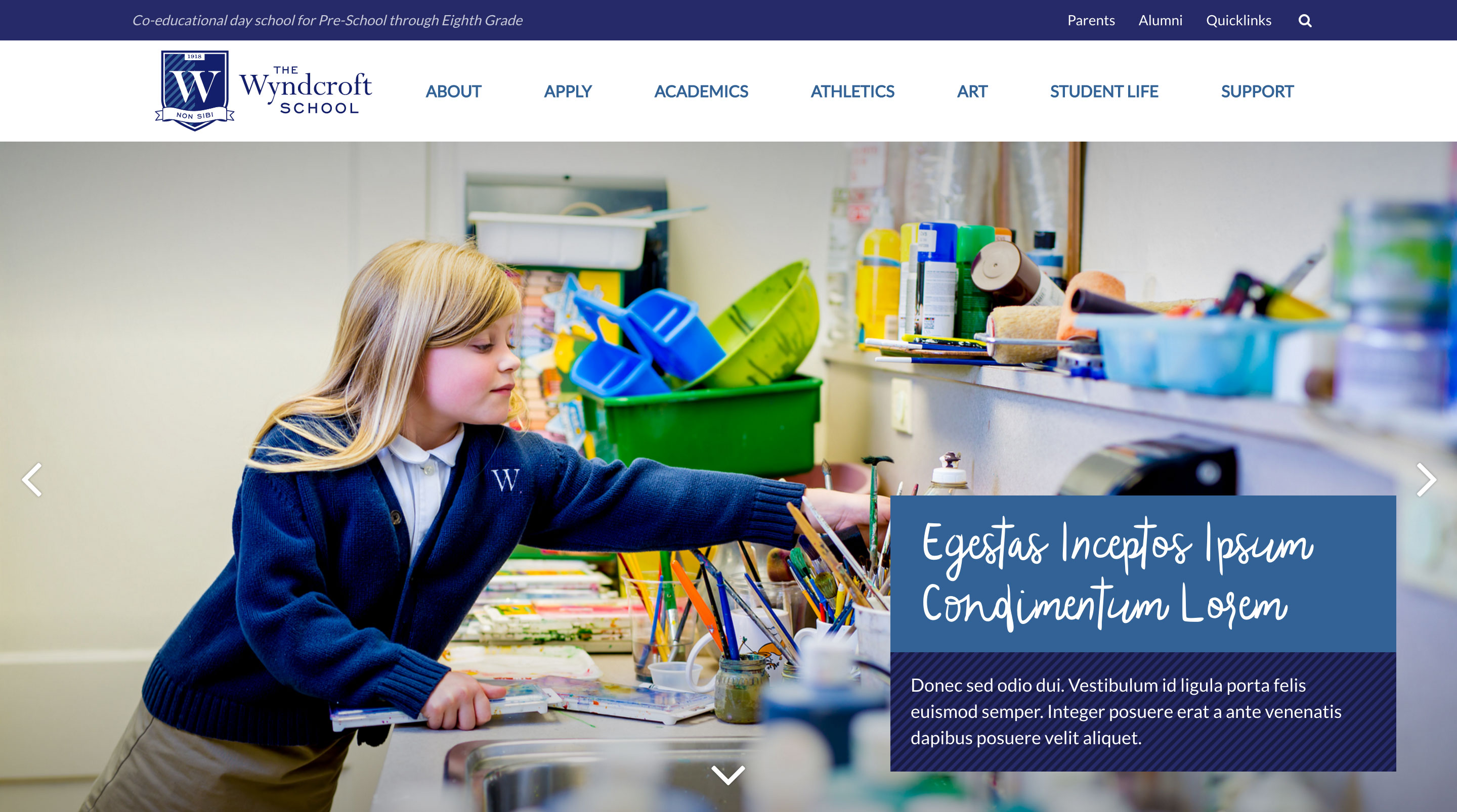
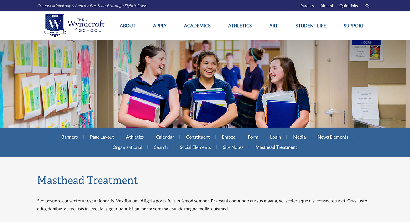
Homepage Header and Masthead View
The Problem
It had been years since The Wyndcroft School redid their website and student/family portal. The site was no longer in step with the marketing goals of the school. The brand was not well represented and the existing site was not optimized for the kind of information site users wanted to see. One specific area to address was site responsiveness.
By developing a new website the school hoped to increase matriculation, engagement and communication.
While a Finalsite employee, I contributed to the creation of this new responsive website as the lead designer and lead engineer on the project. Finalsite is a leading provider of cutting-edge web solutions for private and independent schools.
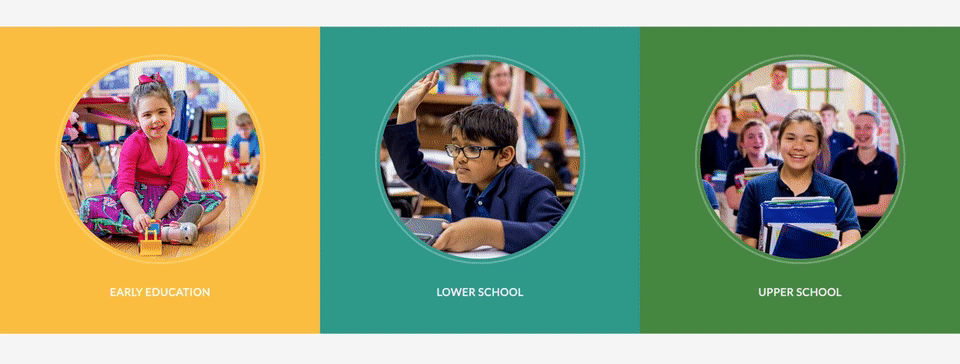
Homepage School Information Tiles
Process
Information Gathering
A survey was shared with the school to discuss their goals and vision for a new website. The survey dived into school branding and current marketing strategy. As designer on the project, this information was reviewed and an initial call was held with the client to further discuss the goals, structure, and look-and-feel of the new site.
The Project Manager and I were regularly in touch with project leads at the school to ensure we were on the right path and delivering a fantastic new website.
Design
I served as both engineer and designer on this project. I did design in conjunction with the actual site build-out rather than using Photoshop or Sketch to create mock-ups that get passed off to a separate front end engineer. Doing these two phases together saved the team a significant amount of time and allowed us to explore animation and interaction design earlier in the process.
The design went through a series of revisions with the client until approval was received. Iterations were presented using prototyping and Invision.
Build-Out
The new responsive website was built upon Finalsite’s Composer platform. Front-end development work made use of Git versioning control, Gulp JavaScript task runner, JS/JQuery, Sass, and a variety of JQuery plugins.
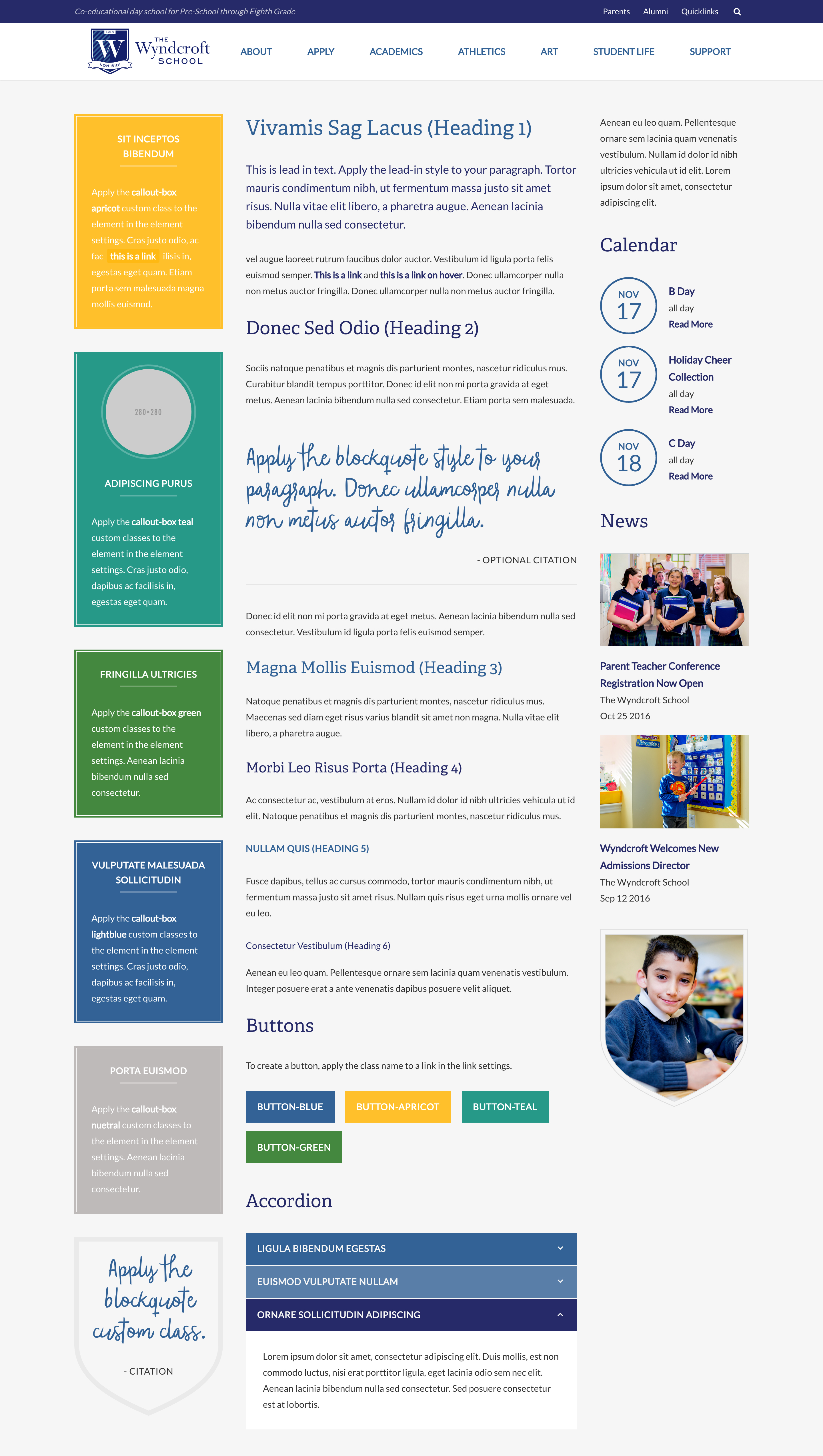
Example Interior Elements
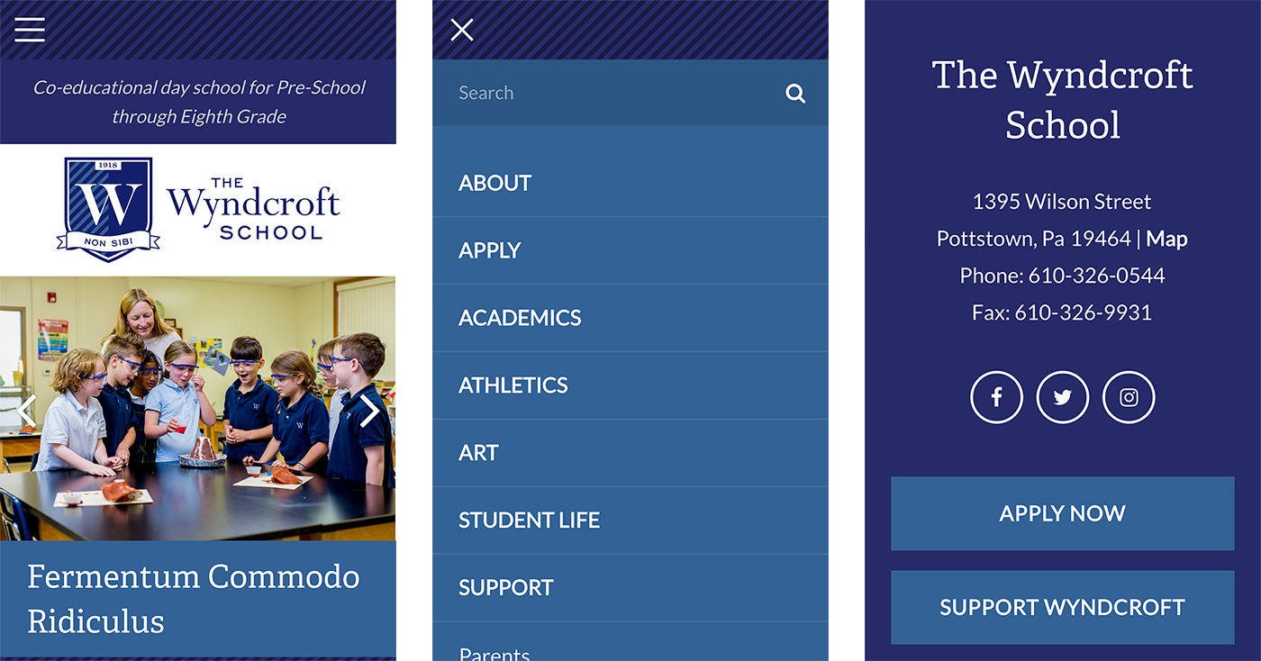
Example Mobile Views
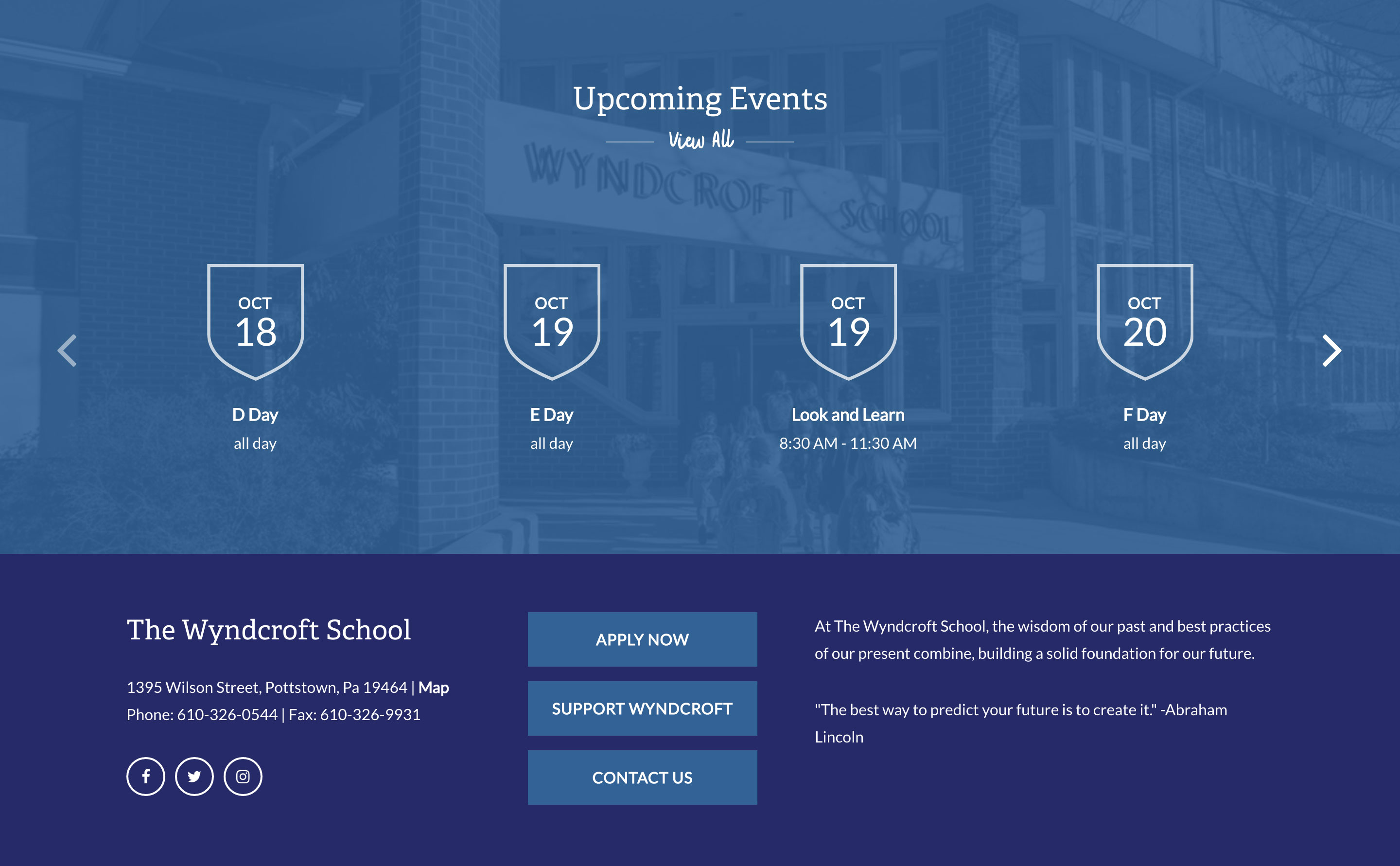
Homepage Calendar and Footer Treatments
Landing Page Treatment