A New Slider Pattern
A positive experience with your product is dependent on the sum of its parts. The usability of smaller interactions can not be ignored. I set out to refine and polish the experience around numerical input, an interaction that occurs throghout the platform experience.
Initial Research
A new project required a design solution for allowing the user to input numerical values. I did a review of current patterns for handling this interaction.
I talked to our internal customer facing team about their experiences with existing patterns and what they heard from our customers on the subject.
The following problems were identified:
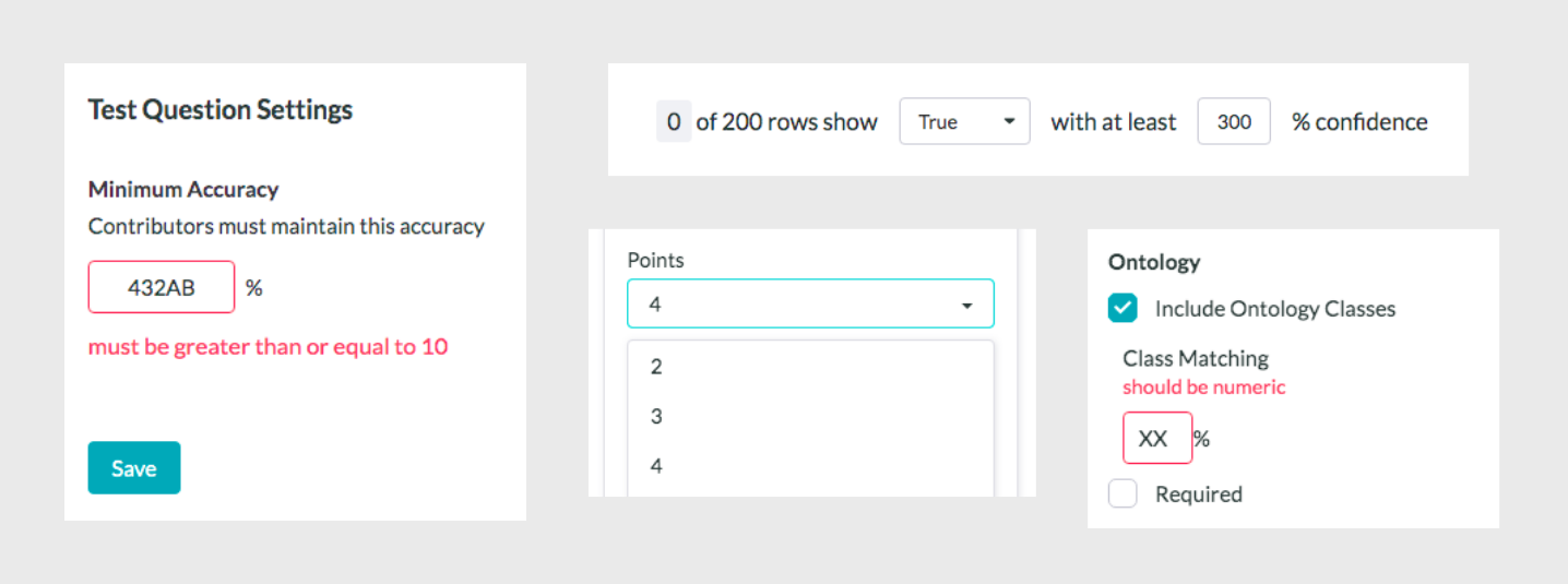
- Overall inconsistency across the platform. The majority of cases were handled with single text input fields. In some cases, dropdowns with a lengthy list of selectable values were used.
- With single text input fields, we had to include validation mechanisms that often failed to indicate to the user what was happening. For example, automatically trimming the decimal values off an integer.
- Also with single text input fields, we had to include messages for error handling that occur after saving. For example, a user inputs non-numeric character into input text.

Current problematic patterns for inputing a numerical value.
Ideation
With an understanding of the above issues, I began to research a pattern that would accommodate the needs of diverse numerical input data collection going forward. I helped to define these requirements of a new pattern:
- Input can handle a range of numerical value types (integers, decimals, percentages).
- The pattern should allow for custom units. For example 10 pixels or 10 dollars.
- Input allows for setting a range (for example 2 to 100).
- Input allows for a large range of numbers.
- Minimize probability of wrong inputs and/or errors.
The benefits of a slider, as they pertain to this project, can be summed up as such:
- The greatest benefit is constraints. No errors, no validation mechanisms, and no incorrect inputs.
- The slider is an intuitive and well established pattern.
- Sliders can be designed to accommodate different thresholds, values, and intervals.
- Sliders can accommodate the selection of a range of values.
Sliders did not exist on the platform and were not part of our design system. After doing our research, we decided that creating a slider pattern to use going forward on the platform, and to replace other patterns, was well justified.
Iterative Prototyping

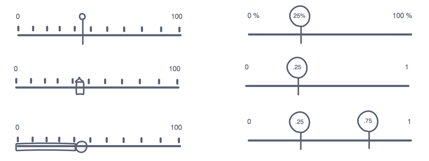
Initial slider concepts.
I created a working prototype that allowed me to adapt values for certain use cases and test the interaction with internal team members.
A code prototype of the slider.
To nail down the visual design, I looked at examples of sliders. Both Dribbble and Pinterest had a great collection of slider designs, showing a variety of use cases. I brought in our platform look and feel, planning for this slider to become a standard pattern within our existing design system. Our platform did have a design pattern for a video player progress bar that helped to inform the design.
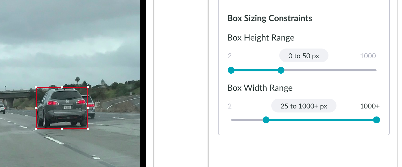
By the end of the project, we had a new pattern that was designed to accommodate multiple numerical value types, including a range of values. The pattern is responsive to different container widths. Thanks to prototyping and testing, the team was confident in its usability.

An implementation of the new slider pattern